Sample: How to add charts (with examples of every type)
A sample guide to the Chart block: line graphs, bar charts, pie and doughnut charts and histograms, with the exact data used for each one.

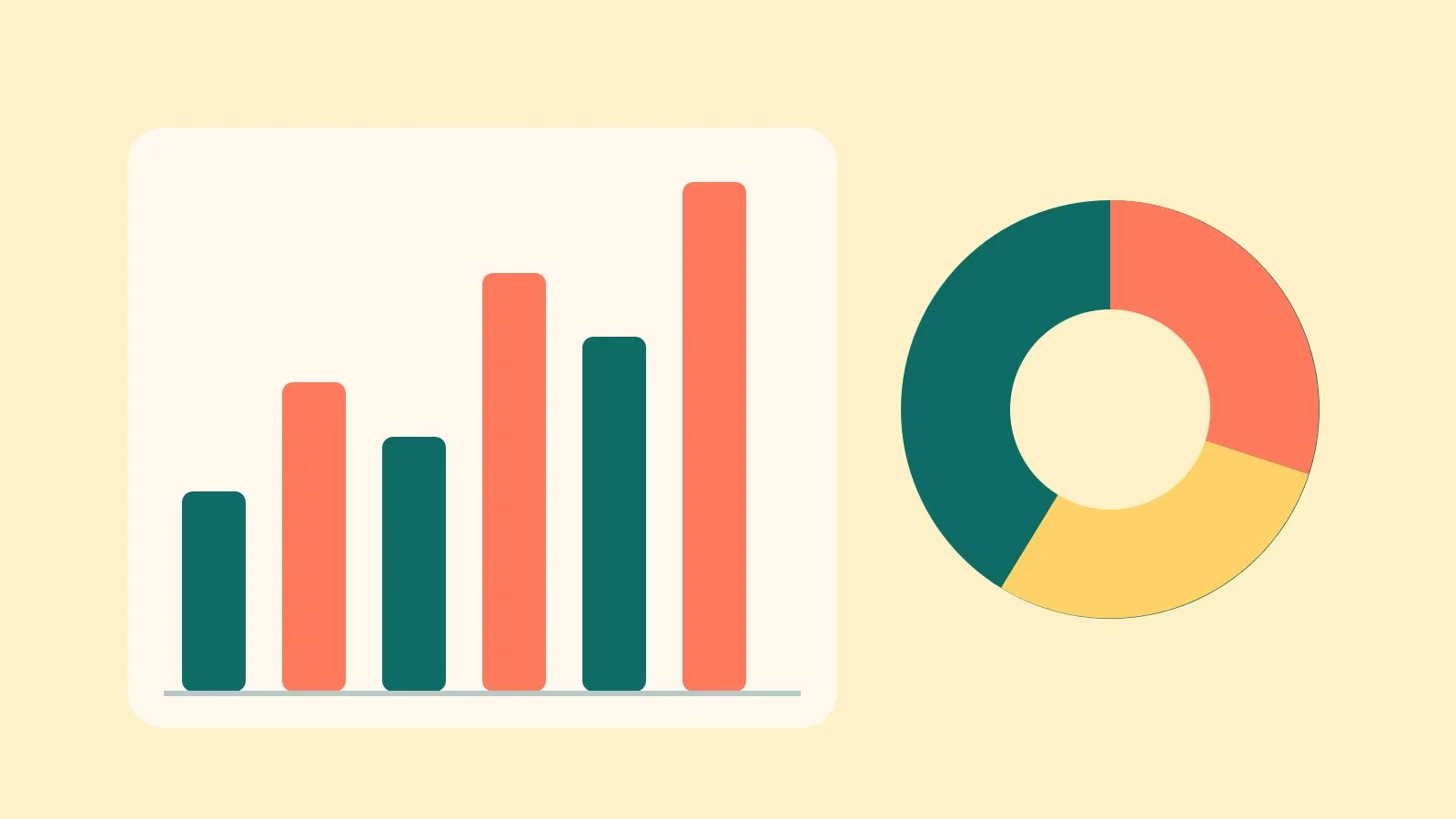
Illustration: MarginNotesClub
Key points
- Insert a Chart block from the editor’s + menu and pick the chart type.
- Type or paste the data one item per line, with a comma between the label and the number.
- For two or more lines or bars, put the names on the first line.
- For a histogram, just list the numbers; the site groups them for you.
In this article 7 sections
This is a sample article. It shows each chart type with the exact data typed into the Chart block, so you can copy the pattern. All figures are invented. Delete this article whenever you like.
A chart should answer one question at a glance. If it needs a paragraph to explain, it’s the wrong chart.
How to insert a chart
In the article editor, tap + and choose Chart. Then fill in:
- Chart type: bar, line, pie, doughnut or histogram.
- Chart title: say what it shows, including the unit, e.g. “People waiting (millions)”.
- Data: one item per line (see the examples below).
- Unit: optional, e.g.
%,£,morweeks. £ and $ go before the number; everything else goes after. - Caption or source: optional, shown under the chart.
Every chart gets a Show the data link underneath, so readers (and screen readers) can see the exact figures.
Bar chart: compare amounts
What was typed in the Data box:
North, 42
Midlands, 38
London, 51
South West, 29
Invented figures for illustration.
Show the data
| Example: patients waiting over a year, by region (thousands) | |
|---|---|
| North | 42k |
| Midlands | 38k |
| London | 51k |
| South West | 29k |
Line graph: change over time
For two or more lines, put the names on the first line, starting with a heading for the labels:
Month, 2025, 2026
Jan, 7.1, 7.4
Feb, 7.2, 7.5
Mar, 7.2, 7.6
Apr, 7.3, 7.6
May, 7.3, 7.7
Jun, 7.4, 7.7
- 2025
- 2026
Invented figures for illustration.
Show the data
| 2025 | 2026 | |
|---|---|---|
| Jan | 7.1m | 7.4m |
| Feb | 7.2m | 7.5m |
| Mar | 7.2m | 7.6m |
| Apr | 7.3m | 7.6m |
| May | 7.3m | 7.7m |
| Jun | 7.4m | 7.7m |
The same data can also be a bar chart with two bars per month: choose Bar chart and keep the same data.
Pie chart: parts of a whole
Use pie charts only for parts of one whole (they should add up to 100%) and with 6 slices or fewer. Smaller slices beyond that are grouped as “Other” automatically.
Rent or mortgage, 38
Food, 14
Transport, 11
Energy, 9
Savings, 8
Everything else, 20
- Rent or mortgage 38%
- Everything else 20%
- Food 14%
- Transport 11%
- Energy 9%
- Savings 8%
Show the data
| Item | Example: where a monthly budget goes |
|---|---|
| Rent or mortgage | 38% |
| Food | 14% |
| Transport | 11% |
| Energy | 9% |
| Savings | 8% |
| Everything else | 20% |
Doughnut chart: parts of a whole, with the total
Same data format as a pie chart. The total appears in the middle.
Doctors, 120
Nurses, 340
Radiographers, 45
Admin, 95
- Nurses 57%
- Doctors 20%
- Admin 16%
- Radiographers 8%
Show the data
| Item | Example: staff in an imaging department |
|---|---|
| Doctors | 120 |
| Nurses | 340 |
| Radiographers | 45 |
| Admin | 95 |
Histogram: how a list of numbers is spread out
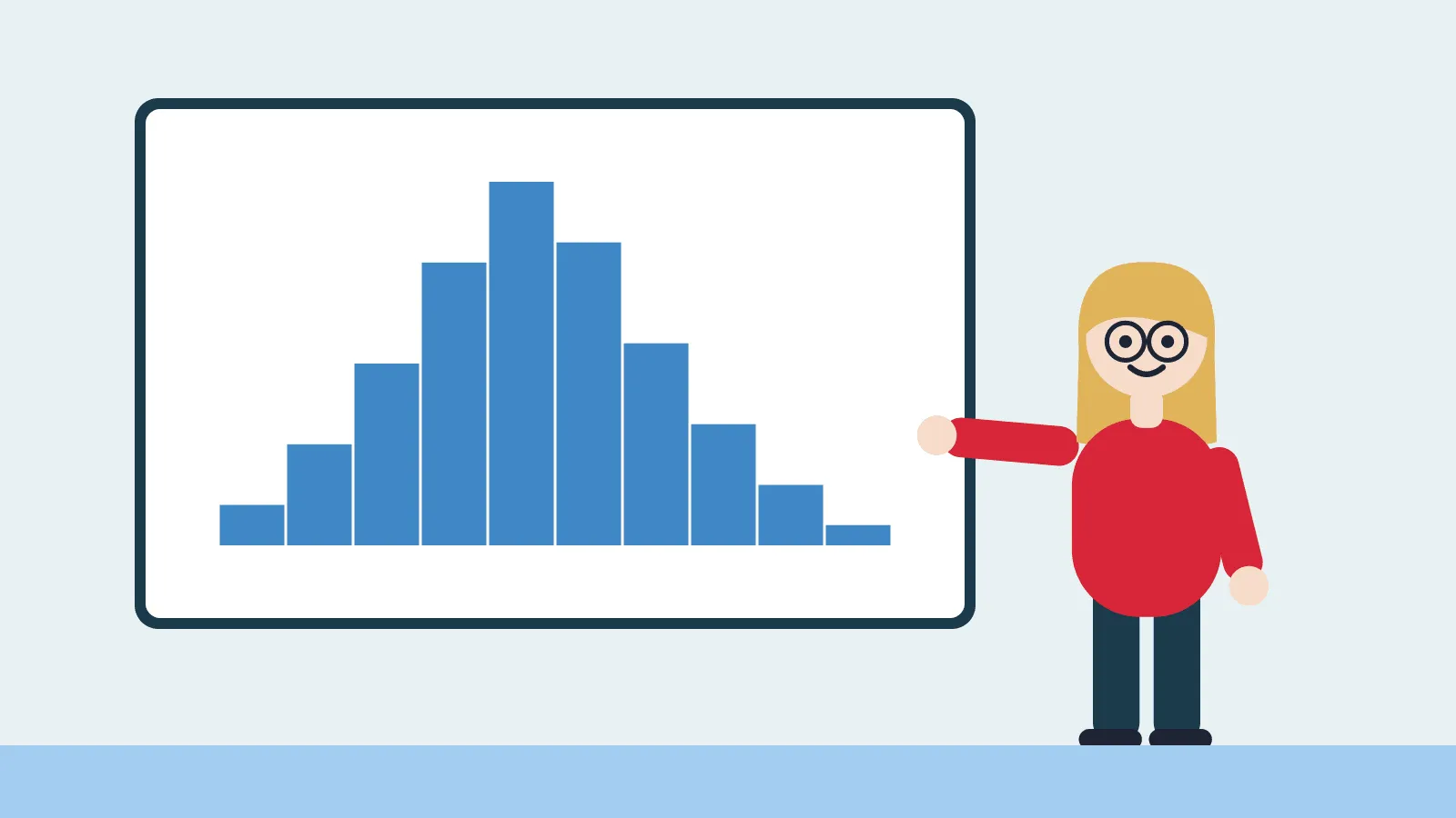
Just list the numbers, one per line or separated by commas. The site sorts them into groups. Leave number of groups empty to choose automatically, or set it (e.g. 6).
2, 3, 3, 4, 5, 5, 6, 6, 6, 7, 7, 8, 8, 8, 9, 9, 10, 11, 12, 12, 13, 15, 16, 18, 21, 24, 26, 30
Show the data
| Range | Count |
|---|---|
| 0 weeks to 5 weeks | 4 |
| 5 weeks to 10 weeks | 12 |
| 10 weeks to 15 weeks | 5 |
| 15 weeks to 20 weeks | 3 |
| 20 weeks to 25 weeks | 2 |
| 25 weeks to 30 weeks | 1 |
| 30 weeks to 35 weeks | 1 |
Tips
- Don’t put commas inside numbers. Write
12500, not12,500, because the comma separates the columns. (Pasting from a spreadsheet is fine: those use tabs.) - £, $ and % signs in the data are fine; they’re ignored when reading the numbers. Use the Unit box to show them.
- Long labels are shortened under the chart; the full label is in “Show the data”.
- Up to 5 lines or bar groups per chart. More than that is hard to read, so split it into two charts.
- Check the chart on your phone after saving: if labels crowd, use shorter labels (e.g. “Jan” instead of “January”).